Pantone Inc.’s color of the year serves consumers by surrounding us in the color they feel like we need to see. In 2011 the color was “honeysuckle” because “in times of stress, we need something to lift our spirits. Honeysuckle is a captivating, stimulating color that gets the adrenaline going — perfect to ward off the blues,” according to Leatrice Eiseman, Pantone’s Executive Director.
In the end of November, Pantone published the article “Spring 2016: A Transporting and Transformative Canvas,” wherein they discussed what they want the color of the year to represent. The perfect color would “transcende cultural and gender norms.”

That’s why my vote was for Pantone 15-1040 Iced Coffee.
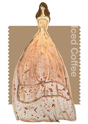
It’s warmth is perfect for every season and would compliment all skin tones, and it’s a color both men and women could rock. Plus, in 2006, the color of the year was Sand Dollar and I thought it apt for a 10 year anniversary to have another neutral color. But alas, Pantone did something no one predicted — they decided two colors would best suit 2016.
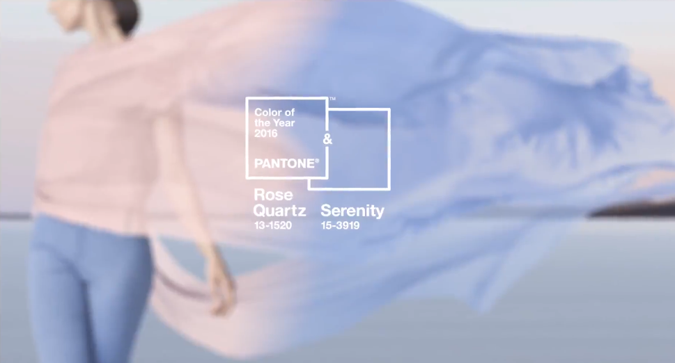
Originally when I saw this I didn’t know what to think. Blue and pink certainty are the quintessential baby colors — think gender reveal parties — even if it hasn’t always been the case. In the mid-19th century pastels were common baby colors, no matter the sex of the child. Pink was often thought as bold and belonged on a boy, while blue was thought as dainty. In the 1940s manufacturers and retailers started to establish feminine and masculine colors, but it wasn’t until the ‘80s took off and ran with them.
Pantone is redefining what consumers interpret as “masculine” and “feminine” colors. Come spring 2016, perhaps we will see men models embracing rose quartz-colored blazers or slacks.


