From the Brand+Aid Intern’s Desk: #Instabrand – An Analysis of Instagram
By now, any regular social media user has at least heard of Instagram, the immensely popular photo sharing app. Instagram allows its 300 million active users to capture (or import) and edit photos and videos to post on their profiles. On top of that, it allows users to share their posts across a wide variety of other social media platforms, from Facebook to Twitter to Tumblr and so on. Also, one of the app’s most recognizable features is its filter option. Users can add a bunch of different filters to their photos and videos to customize the look of their posts.
Instagram is a widely used social media platform for businesses and other organizations. Its easy-to-use interface and quick media sharing methods make it ideal for companies to reach out to and connect with their customers and target markets. Just like on Twitter and Facebook, hashtags play an important role in branding on Instagram. Also, because of its ever-growing popularity, its number of users is continually increasing. Because of this, branding on Instagram is extremely useful and lucrative.
But what about Instagram’s own branding? Obviously if they’ve become so popular, they must be doing something right. When looking at their own Instagram profile, it seems like they are. Their profile highlights popular posts on the app, especially art posts, as well as special hashtag campaigns that help them connect with their users and followers. For example, right now they’re doing something on weekends called Weekend Hashtag Project, where each weekend is a different theme. Their latest WHP post is #WHPhairplay, where they ask followers to submit posts featuring cool hair or facial hair.
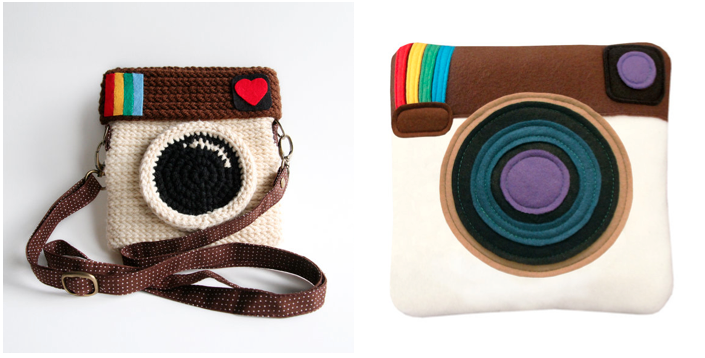
Now let’s turn our attention to their logo use. When you think of Instagram, the first image that pops into your head is probably the well-known square camera logo. Personally, I think this logo is beautiful and original. It’s something that you’ll remember after seeing it because it’s so self-explanatory. In fact, the logo is so popular and so representing of the application itself, it has been made into lots of different merchandise outside of the company. A few examples are this bag and this pillow on Etsy.
Despite the widespread recognition of the square camera logo, it isn’t always Instagram’s go-to logo. Sometimes they use an entirely text-based logo. The logo started off in black, somewhat messier script and was slightly altered in 2013 to a blue, cleaner script. While I definitely prefer the camera logo, I do understand the need for an alternate logo that’s less square and more easily placed in certain situations.
Whether you’re sharing an artsy photo of your coffee or a selfie, you’ll most likely be sharing it on Instagram. The app is doing very well for itself based on statistics, and they have a visually pleasing and unique logo that just sticks with you. All in all, Instagram is a branding example we can all learn from.
Sources:
http://instagram.com
http://expandedramblings.com/index.php/important-instagram-stats/
https://www.facebook.com/Instagram
http://www.businessinsider.com/instagram-demographics-2013-12
https://www.etsy.com/listing/103459597/instagram-purse-love-ig-original-color
https://www.etsy.com/listing/128727876/instagram-pillow?ga_order=most_relevant&ga_search_type=all&ga_view_type=gallery&ga_search_query=instagram&ref=sr_gallery_29
http://thenextweb.com/dd/2013/05/02/instagram-redesigns-its-script-logotype-with-a-cleaner-look-hes-an-inside-look/

