Hi Brand+Aid followers!
Check out this blog post written by one of our lovely interns, Manny.
An Evolution of NBA Logos
The 2015 NBA draft has ended with some spectacular picks. For example, Karl Anthony Town was drafted at number one by the Minnesota Timberwolves. He was followed by The Los Angeles Lakers’ newest addition, D’Angelo Russell. No matter who your NBA team is, having the first or second pick is like winning the lottery. During the draft, we took a glance over the evolution of NBA team logos, and suddenly noticed the transformation that certain teams have made to their image. Our understanding of branding has helped us dig a little further into our favorite team logos.
The Grizzlies originated in Vancouver, British Colombia, and relocated in 2001 to Memphis, Tennessee. Today, they are known as The Memphis Grizzlies, one of the most exciting NBA teams to watch. The team has made drastic changes, from location, to drafting, and even changing the team logo. Branding is everything when you are settling in a new territory. No matter who your favorite NBA team is, as fans, we sure do appreciate a dominating logo, especially if it reveals your team’s mission. The Vancouver Grizzlies’ logo is pretty alarming and confusing. It’s almost like a logo you would find from a hockey team. I’m not a big fan of the grizzly palming the ball, or the eighties color scheme. Luckily, the new era brought in a new logo.
2001 positioned the Grizzlies on a new stomping ground. The logo was revamped; the “evil grizzly” is what we call it. It speaks for itself: character, tenacity and intimidation. The logo states that “We are here to stay, and that is settled.”
The Phoenix Suns has been my favorite team since the duos of Steve Nash and Amare Stoudemire (I will always have a soft spot for the duos). Along with brand recognition, the team has indeed kept its rich history intact throughout its logo changes. In 1968, the team introduced its first logo, and it’s had four logo changes since then. The bright orange, the lightening purple, and the sunburst are iconic to this organization. However, the 1968 logo looks like a laundry detergent brand, but an unpredictable one. Thankfully, every few decades, teams have the ability to sit down and really reconsider their logos.
The present logo tends to move away from the iconic purple, but they have kept the transitional bright orange and indeed went with the 1990s bevel look and feel. This image reminds us of Barkley, when he was a Sun. We are excited to see if this look into the team’s history will help improve their present situation.
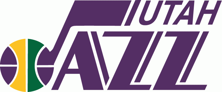
New Orleans is known for jazz, cuisine and its epic festivals; Utah, on the other hand, is the complete opposite. The Utah Jazz, being brought from New Orleans, had one of the hardest transitional barriers to overcome; yet they have found a way to keep audiences on their feet. Today, the Jazz has the most loyal fans on the market, although as a team they have not been so successful since the duos of Stockton and Malone. Their 1979 logo is pretty elegant; it shows a lot of character and poise. This logo has created an exciting atmosphere for a long time.
The present Utah Jazz logo screams the city’s name. It’s a brilliant logo that fits the surroundings; it’s neither flashy nor jazzy but at the same time it’s classy. 